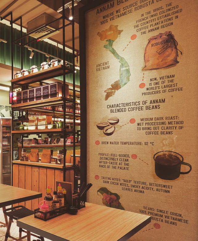
In 2011 Chef Nam Nguyen approached us with his vision for a casual quick-service Vietnamese restaurant. We worked closely with Chef Nam and his team to develop the brand’s visual identity including logo, color Palette, typography, illustration, as well as all in-store signage and menus.
Taking inspiration from the vibrant streets of Vietnam and colorful Vietnam war propaganda posters, a bold and playful logo mark and color palette was developed.
NamNam’s expansion for the first few years was solely within Singapore and the original website worked well, but as the brand expanded into neighboring Malaysia, Indonesia and Bali, a website update was required to better showcase the brand ethos as well as manage its continual domestic and foreign growth.
Over the last few years as Namnam ventured into the digital sphere with online sales and table bookings the crucial role the website played in brand building and success became more apparent, and therefore, a primary objective of the site rebuild was to improve the quality and quantity of website traffic.
While we never promise our clients first page Google rankings and generally SEO strategists who do should be avoided, our SEO strategy proved quite successful with a 1,000% increase in organic search traffic and a first page ranking using our targeted key phrases.
Fresh herbs and spices are the foundation of Vietnamese cuisine and used throughout NamNam's menu. We created a set of illustrations showcasing some of these key ingredients.
A magical boutique hotel set on the bank of the Chao Phraya River in the heart of Old Bangkok.
Tucked away in acres of gardens and lotus ponds, escape from the bustle of Bangkok to a sanctuary of soothing calm and subtle luxury.